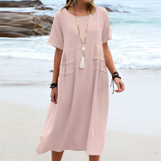
How to Wear Animal Prints with Elegance
Animal print has a complicated reputation, and it rests on a misunderstanding. It is not a loud motif, it is a dense one. The difference is technical, and it explains just about every failed outfit in the category.
Leopard behaves like a neutral
Look at a classic leopard print with your eyes half closed: it blurs into a tawny brown mass. The spots disappear, the average colour stays. That is precisely the definition of a neutral.
Practical consequence: leopard combines like camel. With black, white, navy, denim, red, khaki. It is also why it works next to a stripe, which sounds daring and is not at all — the principle is covered in the piece on mixing prints.
Zebra and python do not behave the same way. Zebra is a high-contrast motif: it does not blur, it stays visible across a room, and it should be treated like an assertive colour rather than a neutral. Python sits between the two, closer to leopard when it comes in natural tones.
One piece only, the rule that holds
Leopard trousers with a leopard blouse gives you a costume. One animal piece per outfit, and the effect shifts from fancy dress to deliberate detail.
The one exception that works: same scale, same colour family, on widely separated surfaces. A belt and a shoe, for instance. They do not touch, and the eye reads them as an echo rather than a set.
Motif scale sets the register
This is the most neglected variable and the most decisive.
- Small, tightly packed spots: reads quiet, almost textural. This is the version that works in an office.
- Medium spots: the classic, the one on trench coats and scarves. Versatile.
- Large spaced spots: reads strong and fashion-forward. On a wide garment it occupies the whole silhouette. Keep it to small surfaces if the motif makes you nervous.
The simple rule: the larger the garment surface, the smaller the motif scale should be.
The background colour matters more than the spots
Leopard on a sand background is a warm neutral. Leopard on grey is a cool neutral. Leopard on pink or blue is no longer a neutral at all, it is a coloured print and has to be treated as one.
That distinction settles most of the hesitation. Before buying, identify the ground, not the drawing.
Accessories, the way in
If the idea makes you uncomfortable, start at the bottom or with an accessory. An animal-print shoe under a plain outfit does exactly the same job as a shoe in a strong colour: it gives a focal point without committing the silhouette.
Our comfort shoes and sandals suit that role, and an animal-print bag is a genuinely useful replacement for a black one: it matches as many outfits and says more.
What actually goes wrong
- Shiny fabric. Leopard on glossy satin or a coated finish tips straight into fancy dress. The same motif on matte cotton, knit or linen passes without effort. The material does more than the motif, as usual — the fabric guide goes into it.
- Stacked accessories. Animal shoe, bag and belt together cancel the neutral effect and rebuild the costume.
- A flat print on a very tight cut. The drawing distorts at the tension points and loses legibility.
- A misaligned print. On a well-made garment the motif matches across the seams. That matching costs fabric, which makes it a quality signal — the thirty-second test covers how to check it.
Free shipping over €35 and 30-day returns. For a first attempt, the shoe stays the smallest commitment and the most visible effect.
In the VoltÉlan catalogue


Shop the Best Sellers edit
-
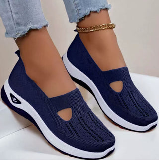 SNEEK Comfort Sneakers for Women — Memory Foam Insole, Breathable Knit
37,99 €
SNEEK Comfort Sneakers for Women — Memory Foam Insole, Breathable Knit
37,99 €
-
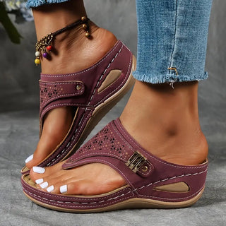 Élise Comfort Sandals — Contoured Footbed, Wide Straps
34,99 €
Élise Comfort Sandals — Contoured Footbed, Wide Straps
34,99 €
-
 Hivery Winter Shoes — Warm Lining, Cushioned Sole
34,90 €
Hivery Winter Shoes — Warm Lining, Cushioned Sole
34,90 €
-
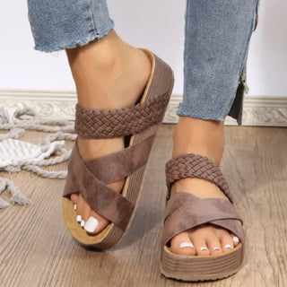 Women's Woven Casual Sandals - Summer Comfort
31,99 €
Women's Woven Casual Sandals - Summer Comfort
31,99 €