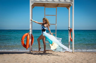
Mastering Mix-and-Match: The Art of Blending Prints Like a Pro
Mixing two prints is treated as a style exercise reserved for people with an eye for it. In practice it is arithmetic. There are three variables — colour, scale, density — and locking down two of them is enough to make the combination hold.
Variable 1: one shared colour, the same one
This is the most reliable shortcut. If both prints share an identical colour, the eye connects the two surfaces and reads one outfit instead of two garments layered by mistake.
Watch the word identical. Navy and royal blue do not connect, they contradict, and the result looks accidental. Ecru and pure white do not either. Test it in daylight, both pieces flat and side by side: either the shared colour jumps out, or it does not exist.
The background matters more than the motif. Two prints on a cream ground almost always agree, even when the drawings have nothing in common.
Variable 2: two clearly different scales
Two motifs of the same size fight. The eye hesitates, settles on nothing, and the outfit reads noisy without anyone being able to say why.
The rule is a ratio of at least three. If the first motif is an inch across, the second needs three or more. A large floral with a fine stripe works. A medium floral with a medium polka dot does not.
That also explains why stripe-plus-floral is repeated everywhere and never explained: a stripe is a minimal-scale motif with a single direction, so it behaves almost like a solid.
Variable 3: only one heavy density
Density is how much of the surface the motif occupies. A dense print covers nearly all the ground; an airy one lets it breathe.
Two dense prints saturate, even when colour and scale are handled well. The combination that works pairs one dense with one airy. Concretely: a blouse in tight small florals with widely spaced striped trousers, yes. The same blouse with a full-coverage paisley skirt, no.
Combinations that work without thinking
- Stripe and floral: the most forgiving pair, as long as the stripe is fine and the floral large.
- Polka dot and check: works when both sit in the same two-colour pair, typically black and white.
- Animal and stripe: leopard behaves like a neutral and accepts almost anything. Covered in detail in the piece on animal prints.
- The same motif at two scales: the easy option that never fails, a wide stripe below and a fine stripe above.
The neutral that separates
When two prints meet with no transition, the contrast is abrupt. A plain piece between them — an open cardigan, a wide belt, a jacket — separates the surfaces and settles the whole thing.
It is not compulsory, but it is the spare wheel. If a combination is not working and you cannot say why, put a solid between the two and look again.
What gets forgotten: the fabric
Two prints can agree perfectly on paper and fail on the body, because the fabrics do not hang the same way. A fluid printed viscose next to a stiff printed cotton gives you two volumes that never talk to each other.
Knowing how fabrics actually behave is worth a read before buying the second piece. Our printed blouses usually play the upper half in these combinations, and our flowing dresses allow the opposite exercise: a single print across the whole silhouette, with one printed accessory echoing it.
Free shipping over €35 and 30-day returns. Laying both pieces side by side in daylight is still the only test that counts.
Worth a look on our side


Shop the Best Sellers edit
-
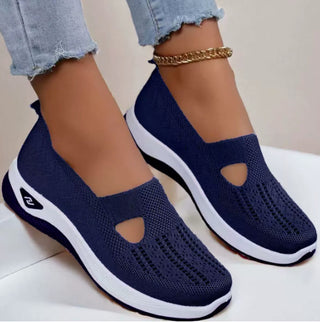 SNEEK Comfort Sneakers for Women — Memory Foam Insole, Breathable Knit
37,99 €
SNEEK Comfort Sneakers for Women — Memory Foam Insole, Breathable Knit
37,99 €
-
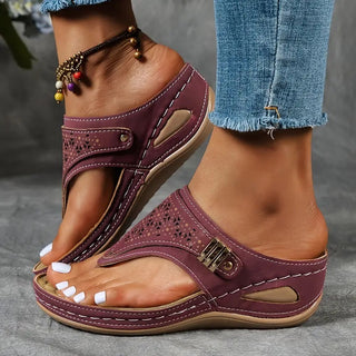 Élise Comfort Sandals — Contoured Footbed, Wide Straps
34,99 €
Élise Comfort Sandals — Contoured Footbed, Wide Straps
34,99 €
-
 Hivery Winter Shoes — Warm Lining, Cushioned Sole
34,90 €
Hivery Winter Shoes — Warm Lining, Cushioned Sole
34,90 €
-
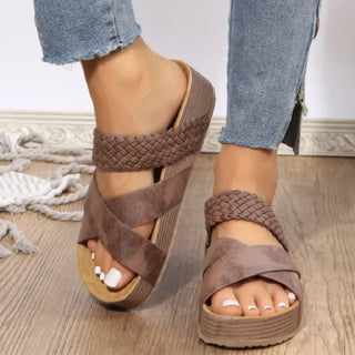 Women's Woven Casual Sandals - Summer Comfort
31,99 €
Women's Woven Casual Sandals - Summer Comfort
31,99 €